Exploring US crime data (Part I)
This time, I decided to write a blog post as I start exploring a new data set for a new project of mine. I'll keep you posted!
February 4th, 2019:
The dataset is gathered and published by the FBI, and publicly available here. However, I did some minimum preprocessing, so if you prefer, you can directly download my copy here.
First, we can plot the time evolution of the murder rate by state for a few states as an example, as well as the overall US rate (you can hover to see specific values, click & drag to select a region, and double click to remove a particular data series):
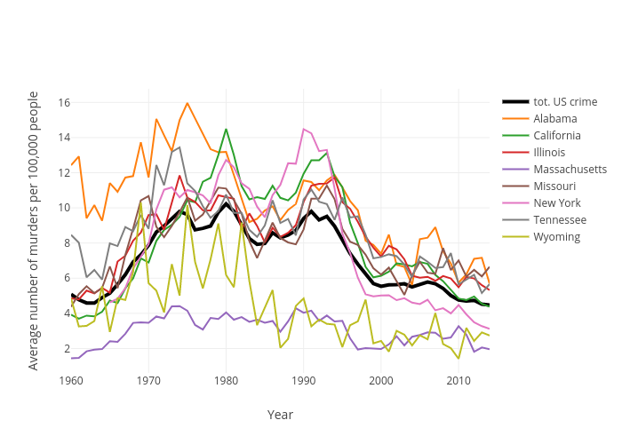
We observe how some states, such as California, Alabama or New York have a higher-than-national-average value, while places like Massachusetts or Wyoming are always or almost always below the national average. But other than that, and the fact that the crime spikes in the 70's-80's, and the later decline in the 2000's, we don't see much more from this data representation. However, I always like to start by a simple plot, to get an idea of what my data looks like. Also useful to spot potential issues early on.
Next, I am going to plot the data for one single year (1960, as an example) on a US map (hover over the states to see the specific values):
What would be really nice to have, is a slider to see how rate crime in the US evolves over time. Coming up next.
---------
February 5th, 2019:
Ok, here it goes, with the slider now!
The jupyter notebook is available on my GitHub. Also, you can check out this other post of mine, for detailed step-by-step info on how to do it.
February 4th, 2019:
The dataset is gathered and published by the FBI, and publicly available here. However, I did some minimum preprocessing, so if you prefer, you can directly download my copy here.
First, we can plot the time evolution of the murder rate by state for a few states as an example, as well as the overall US rate (you can hover to see specific values, click & drag to select a region, and double click to remove a particular data series):
We observe how some states, such as California, Alabama or New York have a higher-than-national-average value, while places like Massachusetts or Wyoming are always or almost always below the national average. But other than that, and the fact that the crime spikes in the 70's-80's, and the later decline in the 2000's, we don't see much more from this data representation. However, I always like to start by a simple plot, to get an idea of what my data looks like. Also useful to spot potential issues early on.
Next, I am going to plot the data for one single year (1960, as an example) on a US map (hover over the states to see the specific values):
What would be really nice to have, is a slider to see how rate crime in the US evolves over time. Coming up next.
---------
February 5th, 2019:
Ok, here it goes, with the slider now!
The jupyter notebook is available on my GitHub. Also, you can check out this other post of mine, for detailed step-by-step info on how to do it.

Comments